
Mayu Wine Family
Package Design / Illustration / Typography / Graphic Design
Mayu is the ancient Inca name for the Milky Way galaxy. Crystal clear skies above the Elqui Valley, Chile’s most northerly vineyards, are as perfect for growing fantastic vines as they are for stargazing.
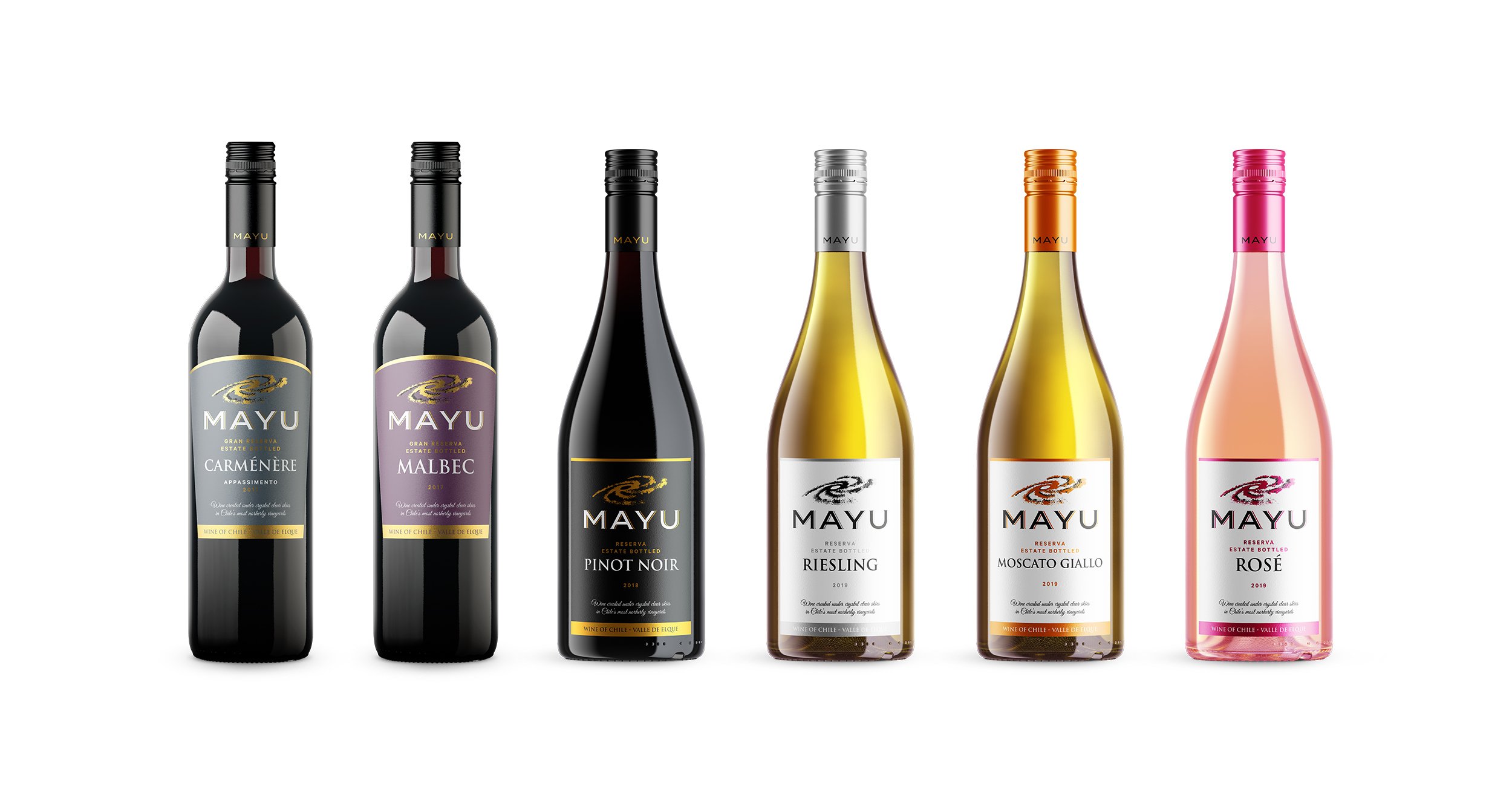
In just a few years the Mayu brand has grown into a large family with many different varieties, including Carménère, Malbec, Riesling, Pinot Noir, and many others. As the wine family grew, problems arose. Different wines had different designs, some were designed in Finland, others in Chile. New upcoming wines had no designs at all. Leijoona was hired to create an improved design concept to gather all the different Mayu wines under one family and one design language.
As Mayu Carménère was already a well known wine among Finnish people, we decided to exploit that brand recognition. We also wanted to improve on the old designs and redesign the Mayu logo while keeping it familiar. The new style had to be bolder and more premium. It was crucial that the new design concept would work with all the current and future wines of the growing Mayu family.
The design concept relies on various means to differentiate between the many wines, such as shape of the labels, colors, foliage, and caps. Different bottle shapes and bottle colors are used to associate the wines correctly. Minimalistic style, elegant serif fonts, foliage and spot gloss varnishing is used to convey a premium mood.
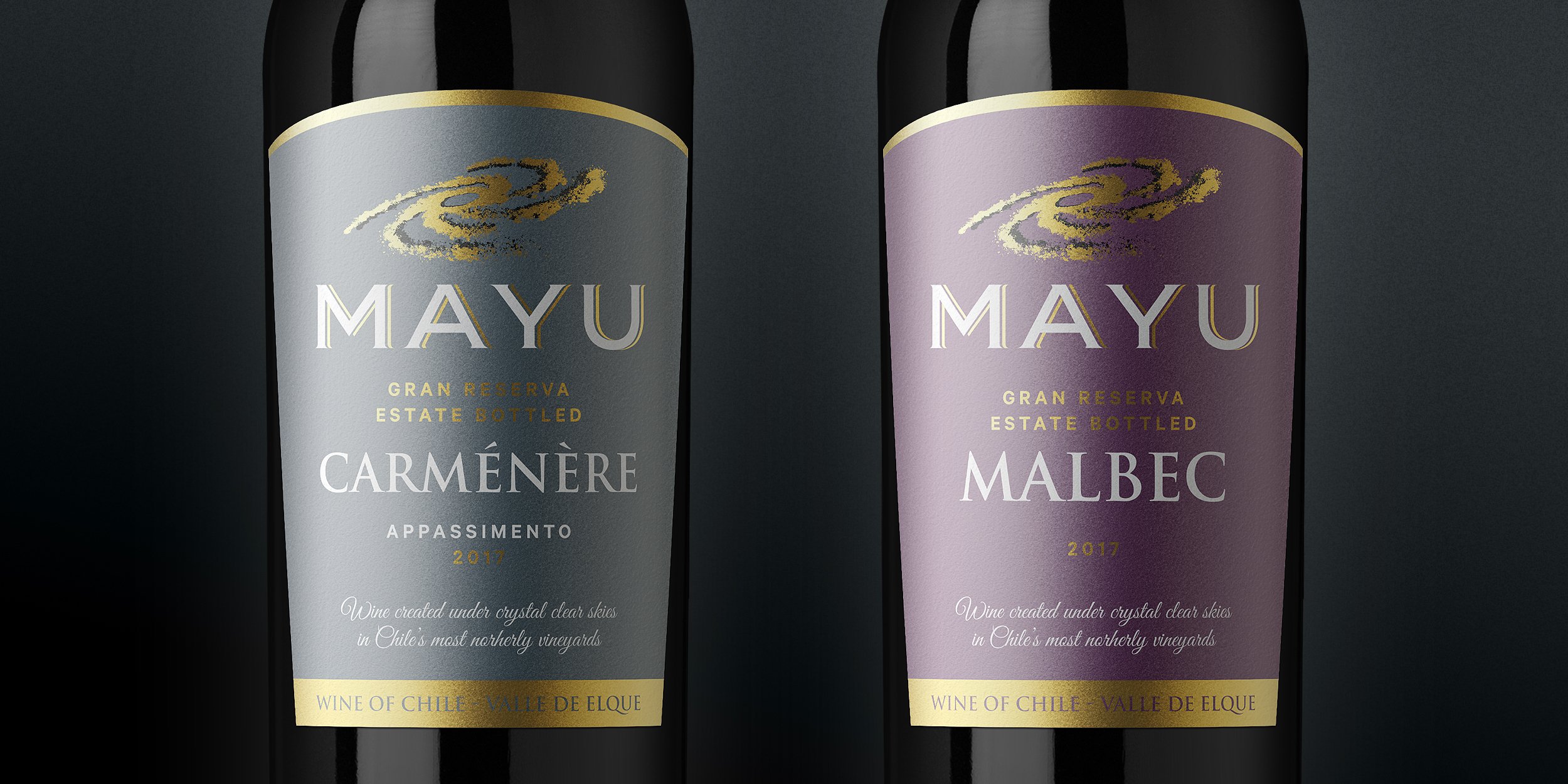
The old Mayu logo (left) was updated (right) to make it stronger and bolder. We also darkened the gray color of Mayu Carménère, the most well-known wine of the family, to help with contrast issues and emphasize the premium feel.

Old label designs (left) were a mess, with different styles, some designed in Finland, others in Chile. Many of the newer wines were missing a design altogether. Updated designs (right) all follow a familiar style to help with recognitio

Mayu Carménère was first of the Mayu wine family to get a gift box for holiday promotion.

With Mayu Carménère's gift box success, we soon followed with another gift box for Mayu Riesling.

Mayu Syrah BIB (bag-in-box) followed a similar style with the milky way galaxy illustration.